
From contrast to flow
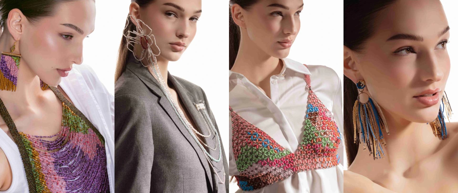
Energetic Contrasts places electric pink and metallic green beside transparent pink, contrasting blue, powder, and creamy orange. The colors do not blend; they sharpen one another. Larger 6/0 Rocailles help each area remain legible at a distance, turning the beaded top into a graphic block of color.
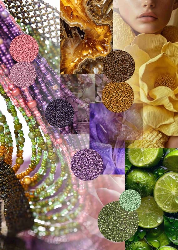
Harmonic Fusion takes the opposite route. Lavender, lilac, pastel pink, and fresh green meet yellow copper and green iris finishes that respond differently to light. Finer 10/0 beads are well suited to this direction because they can build layered transitions instead of hard-edged zones.
Balance and delicacy
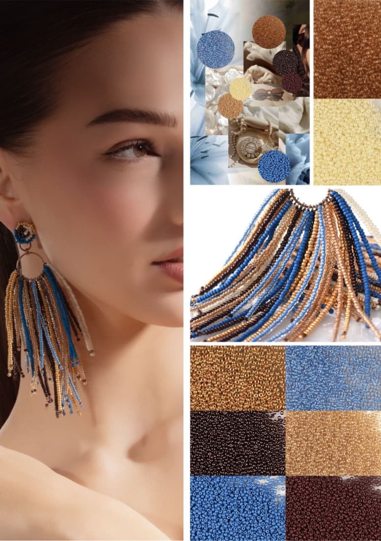
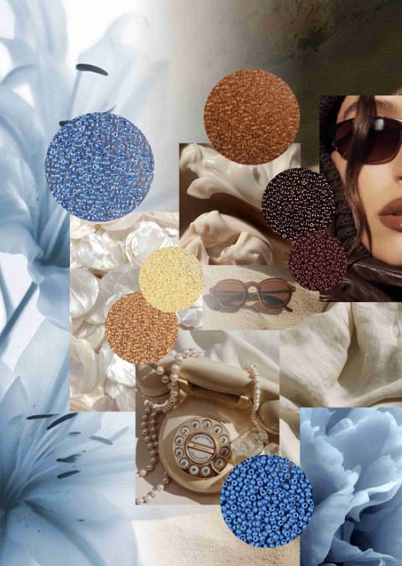
Sophisticated Equilibrium works with champagne, pale gold, chestnut, sand, pearl white, and powder blue. Because the palette is quiet, details such as fringe length, finish, and repetition become easier to see. The tasselled earring example shows that delicate color can still carry a strong presence through movement.
Expressive Delicacy begins with milky white, cream, old pink, delicate mint, light apricot, and stone, then introduces a controlled note of red. In the floral earrings and brooch, color occupies small areas; personality comes from an unexpected nuance and the structure around it rather than saturation alone.
Turning palette into design
There is no need to reproduce all four palettes literally. First choose whether the design should feel energetic, fluid, balanced, or delicate; then sample one lead color, two supporting shades, and one change of finish. The product codes in the official report are particularly useful for comparing how transparency, metallic coating, and lining alter a related hue.